Luis de Javier
A designer who learned structure to break it.
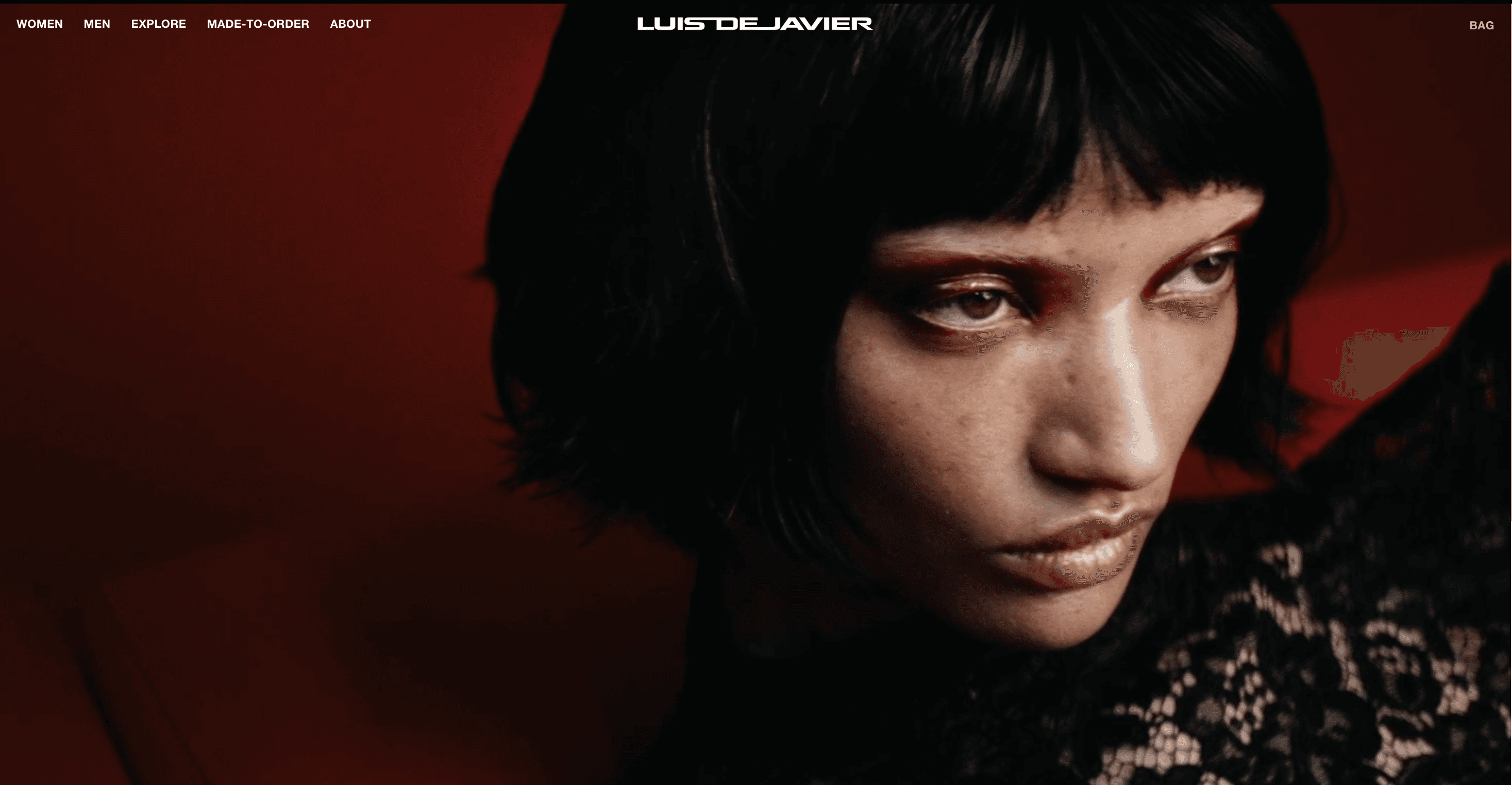
Luis de Javier came up through the ranks of London's most uncompromising fashion houses. Westminster educated, Vivienne Westwood trained, Gareth Pugh sharpened. When he launched his namesake label in 2020, he already knew what he was building toward. His Paris debut for Spring/Summer 2025 confirmed it to the rest of the world.
Challenge
He came to us with a brand that had earned its credibility the hard way and needed a digital home that reflected that. Fashion websites tend to fall into one of two traps: they either try too hard, drowning the work in effects and atmosphere that pull focus from the clothes themselves, or they do too little, presenting garments against white with no point of view and no sense of the person behind them. Neither was right for de Javier. His work lives in the tension between rigour and disruption. There is a clear intellectual architecture to what he makes, references that run deep, construction that rewards close attention. But it also moves. It has an edge that sits just beneath the surface. The site needed to carry all of that without spelling it out.
Process
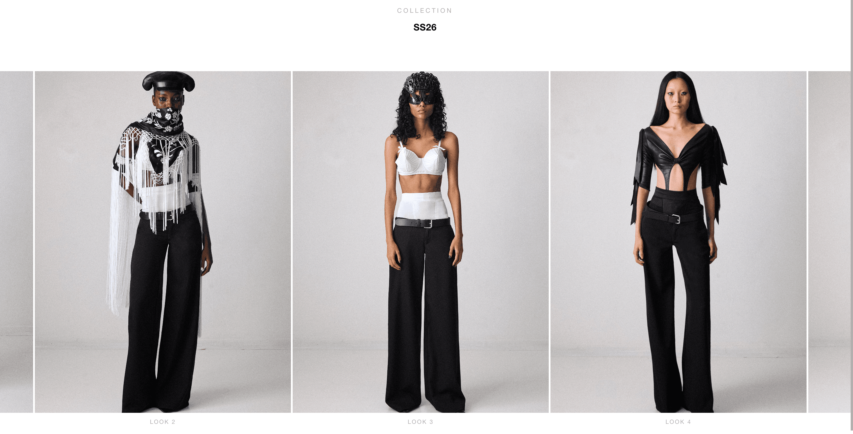
We started by sitting with the work itself. The silhouettes, the references, the through line from his London years to his Paris moment. What emerged was a clear design principle: restraint as a form of confidence. Nothing decorative for the sake of it. Every element earning its place the same way his garments do.
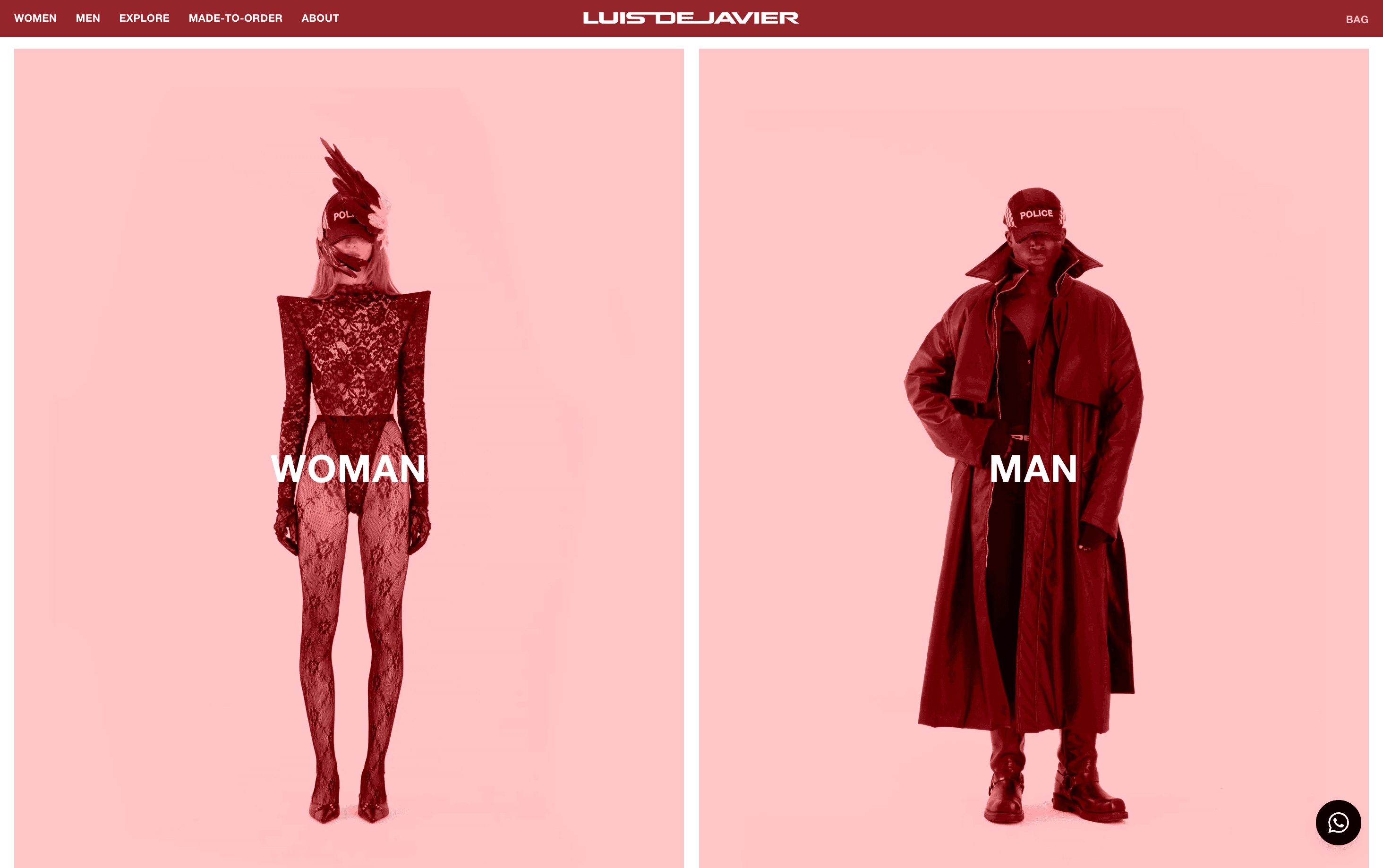
The typography is severe without being cold. The layout gives the imagery room to land rather than crowding it into a grid. Navigation is stripped back so nothing competes with the clothes, and the overall pace of the site mirrors how de Javier works, deliberately, without waste. We treated each collection as its own world within a consistent architecture, letting the work shift tone from season to season without the site ever losing its shape or its voice.
Colour, texture, and motion were all held back until they had something to say. The Spanish sensibility and the London edge that define his perspective needed to come through in atmosphere rather than decoration. A site that feels considered rather than styled.
Results
What came out the other side is a digital presence as precise as the work it holds. A platform built for a designer at an inflection point, one who has done the time, found his voice, and is now building something that will last. The site is ready to grow with him.